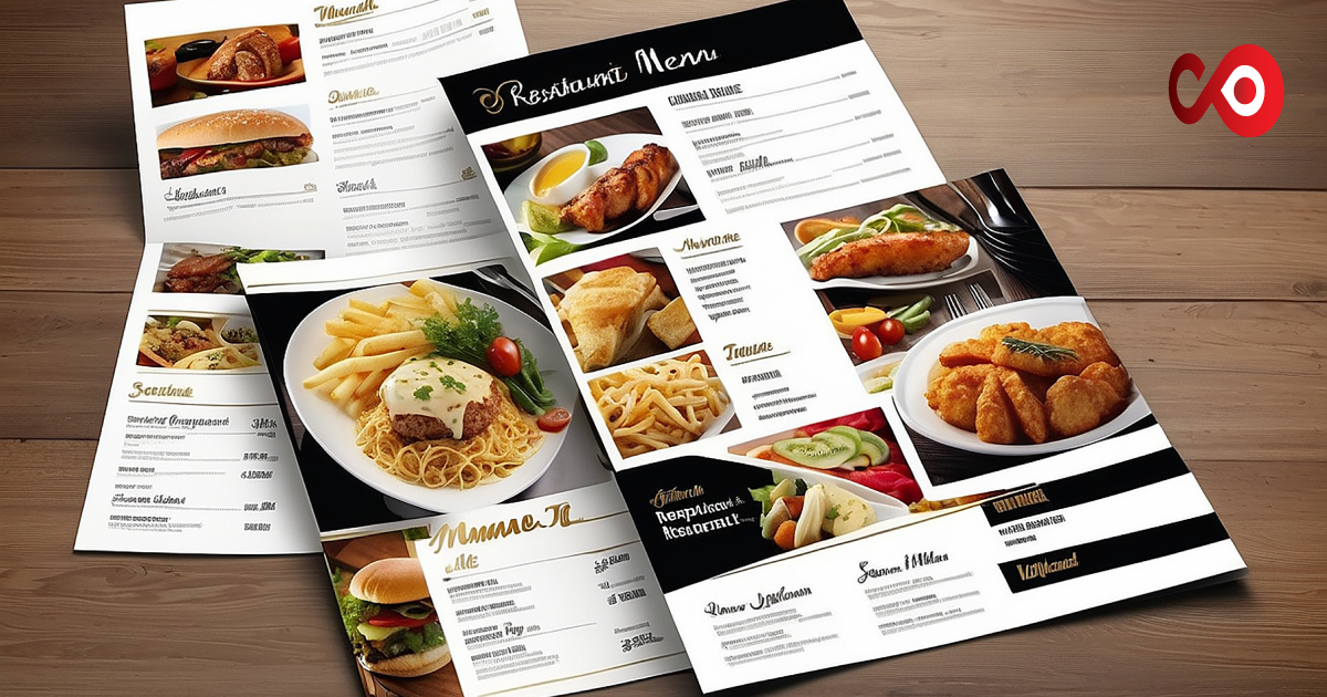
What’s the first thing diners notice when they come into your restaurant? Besides the interior, of course. It’s the menu! The menu is one of the very first things customers notice about a restaurant, and it needs to make a good impression.
By good impression, we don’t mean a menu packed with umpteen items. While those are great, they can be overwhelming for both you and the restaurant. We’re talking about design. A well-designed menu simplifies choosing and ordering for customers and you.
Today, we’ll discuss 8 menu design tips that make customers order more. By the end of this guide, you’ll know exactly how to curate your beautiful dishes perfectly on a menu that appeals to diners easily while packing a punch. Let’s get started.
8 Menu Design Tips That Make Customers Order More
Whether it’s the specials or takeaway menu, a menu layout can make it easy and effective for you and your customers to choose and order. Below are eight menu design and printing tips that will make customers order more.
-
Best-Selling at the Top
This should be a no-brainer, but position your best-selling items on the first few pages of your menu. Make this item your daily special, or you can also put it in the chef’s favourite category just to entice diners a little more.
Use design techniques like boxes, colours, or bold fonts to make these profitable items stand out and catch your customers’ eyes when they open up the menu.
-
Clear and Concise Descriptions
Don’t go all Shakespeare describing your dishes. Let customers go on a delectable culinary journey by tasting your food, not reading the descriptions. Use compelling language in your short descriptions. Focusing on the language is key.
-
High-Quality Images
Nothing says great menu better than some incredible photos of the dishes. 9 times out of 10, people are enticed by images first, without even looking at the name of the food! You want to guide the customer’s gaze with such visuals and feature them sparingly across your menu. Don’t crowd it with pictures, save the pictures for the special items.
-
Manage The Size
All of us can think of one restaurant we’ve been to and the size of the menu alone overwhelmed the hunger out of us. While having a large menu is certainly not an issue, it’s how you organise all the dishes on it. Consider having multiple menus to display your restaurant’s items better.
Sometimes, cheap menu printing online can mess up the layout, so make sure you’re having your menus printed at a reputable place.
-
Typography and Readability
While bold and creative font choices are great, use them in one or two instances. You must use easy-to-read font styles and maintain consistency in font sizes throughout the menu. You don’t want to overwhelm or confuse the reader with too many changes.
-
Pricing Psychology
It doesn’t matter if it’s a specials or a takeaway menu; how you organise pricing will determine sales. Place a pricey dish that complements well with an inexpensive one side by side. This will let you highlight the pricey dish that pairs well with the inexpensive one and make your customers order more.
-
Update The Menu
An old-fashioned menu is a straight-up dud at any restaurant. While this isn’t exactly a design tip, you need to monitor which items are doing well and which are not. Take the poor-performing items off the menu and update your menu periodically with newer items or maybe just new twists on popular items!
-
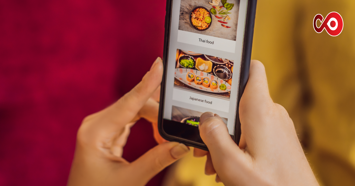
Optimise for Online Menu and Website
In this day and age, you cannot skip optimisation. Make sure to optimise your menu for online and website platforms by uploading PDF versions and featuring photos on your social media platforms. A great way to gauge the success of your menu is to see how it performs online.
Common Mistakes to Avoid When Designing Menus
We’ve given you the tips; now, let’s explore the common mistakes you must avoid when designing and printing menus.
- Overcomplicated Layout: As we’ve discussed, an overcomplicated and hard-to-read menu will not be read and explored. Design and craft a simple layout when menu printing UK for easier and faster orders.
- No Visual Hierarchy: You don’t want uneven visuals and colouring crowding your menu. No visual hierarchy is an instant turn-off for customers.
- Poor Quality Or Borrowed Images: Another major buzzkill is poor quality images or just pictures taken from the internet. It shows poor brand ownership and a lack of professionalism.
- Inconsistent Branding: You want to keep your menu on a singular theme pertaining to your brand, not like it’s from three different places.
- Not Mentioning Dietary Information: This is a crucial mistake as different people have different dietary instructions. Neglecting such things is almost like disrespecting the customer. So make sure to include these when menu printing UK.
- Ignoring Customer Feedback: Of course, you must never ignore customer feedback regarding menu design or any other aspects of your restaurant.
- Ignoring Updates: Consistently update your menu to prevent it from giving the impression of being old-fashioned and outdated.
Takeaway
We hope you enjoyed our guide on menu design tips. Remember that the integrity of your business depends on how you showcase your beloved items on the menu. So be sure to design and craft a cohesive and simple layout. Follow the tips we’ve mentioned, and ask for feedback from diners, as this will determine the success of your restaurant. Don’t forget to visit Chefonline.com for one-stop solutions to your menu printing needs.
FAQs
- What’s The Problem With Inconsistent Formatting?
Inconsistency creates confusion among customers and diminishes professionalism.
- Why Not To Include Pound Signs On A Menu?
Pound signs indicate spending, and not including them allows customers to be more free and relaxed when ordering.


